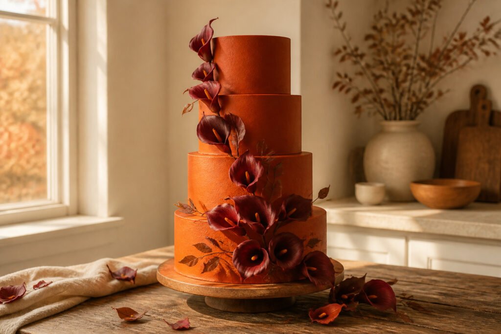
A burnt orange wedding cake is an autumn centerpiece that risks looking flat or overdone if the color sits alone.
The shade needs burgundy for depth, gold for light, or a stark white background to keep it from sinking into rustic cliché.
Gumpaste calla lilies carry the color true because their curved cups hold dust evenly, with no patchy settling in hidden corners.
Gumpaste Calla Lilies and Rhinestone Wrap

Clusters of burnt orange gumpaste calla lilies with burgundy centers sit best where the eye naturally rests, usually the top edge of each tier or cascading from one to the next.
The calla lily’s smooth, curved cup holds saturated color evenly; no nooks for the dust to settle patchy, so the burnt orange reads true across every petal.
A rhinestone bling wrap on the center tier gives the cake its anchor. The band sits at the narrowest point between upper and lower tiers, catching light and drawing the eye inward so the flowers feel arranged rather than scattered.
The contrast between organic gumpaste and geometric sparkle is deliberate; one softens, the other defines.
Keep the rhinestone line level or it tilts the whole cake. The monogram topper that usually pairs with this style belongs dead center above the lilies, not offset, so the verticals line up: topper, flowers, band, tier.
The calla lily’s hollow center takes the burgundy dust deeply, so the color stays rich where a flatter flower might fade.
Flowering Vines on White Tiers

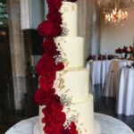
A burnt orange wedding cake built from clean white tiers with vines of gumpaste flowers tumbling down the sides reads autumn without shouting it.
The flowers are burnt orange, the background is deliberately neutral, and the gap between them does the work. Warm color against cool absence of color makes the orange deeper than it would read on an ivory or champagne base.
The plain tiers carry only the vine and a snail trail of piping at each base edge. Nothing else competes.
That restraint matters because gumpaste flowers take hours and cost accordingly; the baker’s time shows in the detail of each petal, and the white space lets the eye rest long enough to notice it.
This is the cake for a couple who wants the seasonal nod to stay elegant. The orange could carry rustic or playful in a different setting, but against stark white tiers with minimal piping, it stays formal.
The vine placement is worth planning tier by tier: too symmetrical and it looks like a pattern, too random and it looks like a mistake.
Most bakers anchor the cascade at the top edge and let it loosen as it falls.
Buttercream Vining with Orange and Burgundy Roses

A burnt orange wedding cake gains depth when the warmth sits against something cooler. Buttercream vines, piped in a trailing pattern around the center of each tier, create a matte, dimensional base that reads as foliage against the cake’s surface.
The line weight of the piping matters: too thin and the vine disappears, too heavy and it competes with the flowers.
Clusters of orange and burgundy gumpaste roses sit at intervals along those vines, and the contrast between the two textures is what saves the design from flatness.
The buttercream stays soft and slightly irregular; the gumpaste holds crisp edges and catches light differently.
Brushing the roses with multiple shades of orange gives them dimension that a single tone would flatten, and burgundy gumpaste berries tucked between the blooms pull the darker value through the whole arrangement.
Orange gumpaste hydrangeas fill the gaps as secondary flowers, repeating the warm note without demanding the eye the way the roses do.
The color pairing reads as autumnal without falling into literal leaf territory. Burnt orange against burgundy is a near-complementary tension; the two sit close enough on the wheel to feel related, far enough to vibrate slightly where they touch.
Against white or ivory tiers, the combination stays elegant rather than rustic. Against a deeper base, it would sink.
Topsy Turvy Stripes and Piped Designs

A topsy turvy cake tilts each tier at an angle so the whole stack looks like it might slide, and the stripes have to obey that same tilt.
On one cake I kept returning to while planning, the top and bottom tiers carried burgundy and orange stripes that followed the angled edge of each tier exactly, so the lines stayed level to the eye even though nothing on the cake actually was.
The center tier broke the pattern with piped designs instead, all of it buttercream under fondant stripes.
That center band of piping gives the eye a place to rest between the two louder tiers, which matters more than I expected when I first saw it.
The overall effect reads playful without looking accidental, which is the line every topsy turvy cake walks.
Orange Fondant with Gold and Silver Sequins

Orange fondant reads as terracotta or rust depending on the light, and gold and silver edible sequins push it toward candlelight glamour rather than autumn rustic.
A cake I saw at a show last year used sequins made from gumpaste and wafer paper, scattered so densely the tiers looked almost enameled.
The maker had built the bottom tier as a double-barrel, then stretched the top to one and a half times normal height, so the proportions felt tall and narrow rather than squat.
The metallic finish is what sells it under reception lights. Warm spots hit the gold and cool spots pick up the silver, so the cake changes as guests move around it.
Scatter reads more modern; a set pattern, like chevrons or an ombre fade from gold at the base to silver at the top, reads more deliberate and takes longer to place.
Either way, the sequins have to go on after transport. One bump in the van and a patterned design becomes random scatter whether you planned it or not.
Expanded Rose on Off-White

An off-white cake with nothing else competing for attention gives a single oversized gumpaste rose the room it needs.
I have seen this spread from the top tier to the bottom, one continuous bloom larger than the tier itself, and the scale is what makes it work.
A quiet base, no piping or texture beyond a thin strip of bling wrap, means the eye goes exactly where the baker intended. One bold element reads as confident; five read as indecision.
The rose’s burnt orange against the neutral fondant carries enough warmth for the whole design, so the restraint is not minimalism for its own sake. It is practical.
Gumpaste work at that size takes time and skill, and letting it sit alone keeps the cost from multiplying across competing details.
Brush Embroidery in Three Colors

Square tiers give brush embroidery a clean geometry to work against, and the fall palette turns the technique into something almost fabric-like.
The method works like this: a piping bag lays down a thin line of buttercream, then a damp brush drags the edge outward before it crusts, leaving a stroke that looks like thread pulled through fondant.
On this cake, that stroke happens in three colors.
Burnt orange sits at the base of each tier, burgundy sits above it, and forest green caps the top edge, so the tiers read as bands of color rather than scattered flowers. The square corners matter more than you’d expect.
A round tier softens the brush marks into waves; the flat planes here let each color hold its line, and the dragged edges meet at the corners with a slight overlap that looks intentional, not messy.
The middle tier carried the fullest treatment, with all three colors layered thick enough that the texture caught reception light.
Purple piped bands at the bottom of each tier acted as a hard border below the soft embroidery, which was the right call. Without that band, the dragged strokes would have trailed off into nothing.
The square format also meant the cake sat closer to the table than a round equivalent; the brushwork read from above and from seated eye level, which is where most guests actually saw it.
Autumn Leaves in Three Oranges and Brown

The most convincing autumn leaf cakes layer three distinct gumpaste colors across the tiers, and the burnt orange wedding cakes that pull this off best treat brown as a necessary shadow rather than a fourth color.
I watched a baker in Asheville sort her leaves into warm orange, deep rust, and raw umber before she ever touched the fondant, and that prep step made the difference between a cake that looked decorated and one that looked collected.
The tone range matters more than the leaf shape.
Real leaves shift from sunlit amber to dried cinnamon on the same branch, and the cakes that remember this scatter the darkest brown leaves at the base of each tier, letting orange drift upward like light hitting the canopy.
Too uniform a color reads as craft store garland; the variation sells the illusion.
Gumpaste gives you about 48 hours of working flexibility before it hardens past adjustment, which means you can reposition a leaf that throws off the gradient.
The mistake I see most often is clustering all three colors together in one bouquet of leaves; the eye catches the grouping and the spell breaks.
Better to thread a single brown leaf into a drift of orange ones, letting it read as a real leaf that fell later or dried faster than its neighbors.
The brown itself should stay muted, almost milk-chocolate rather than espresso.
A dark brown leaf against burnt orange fondant flattens the whole tier into silhouette; a lighter umber recedes visually and lets the orange advance the way autumn light actually behaves.
Chocolate Bands with Airbrushed Leaves

One autumn commission taught me why airbrushed gumpaste leaves outperform piped ones for depth. The baker set chocolate bands at the base of each tier, a clean horizontal anchor that read as ribbon but tasted better than fondant.
Against that brown, she arranged maple and oak leaves cut from gumpaste, then sprayed them with orange edible color.
The airbrushing built the color in passes rather than one flat coat, so the veins stayed lighter and the edges darkened like real October foliage.
The chocolate bands sat low, just above the cake board or separator, which kept the eye moving upward through the leaves rather than stopping at a stripe.
Maple shapes worked best on the top tiers where guests saw them close; the broader oak leaves belonged lower, where their size matched the taller cake surface.
Wafer Paper Leaves in a Cascade

A cascade of wafer paper leaves down a rustic tiered cake reads lighter than the same design in gumpaste. The material prints thin, almost like a real leaf held to the light, and that fragility becomes the point.
Where gumpaste builds structure you could snap between your fingers, wafer paper stays translucent and moves slightly if a guest walks past the table fast.
The source material matters. These leaves carry the vein pattern and color variation of actual autumn foliage because they start from photographs of real leaves, not from hand-painting or generic molds.
That realism pairs naturally with burnt orange wedding cakes, since the color already leans toward the weathered and found rather than the bright and confectionary.
Gumpaste leaves would bulk the cascade and turn it sculptural. Wafer paper keeps it falling, accidental, like leaves that happened to land there.
Handling is the hard part: humidity softens the paper, and the edges can curl if the kitchen runs warm.
Order or print extras; the thin ones crumple during placement, and a twelve-leaf cascade eats more than you’d guess once you account for the ones that tear.
Gumpaste Leaves, Acorns, and Berries

Square tiers give gumpaste leaves, acorns, and berries the flat planes they need to read as a real autumn cluster rather than scattered decoration.
The buttercream base stays soft enough that each element sinks slightly at the stem, which is the detail that makes them look picked rather than manufactured.
I have seen this done where the leaves ride the top edge of each tier and the acorns tuck underneath, so the whole arrangement wraps a corner rather than floating in the center.
That placement works because the square shape gives you four identical corners to repeat the motif, and repetition is what turns three separate gumpaste pieces into one coherent design.
The berries, usually the smallest element, fill the gaps where the leaf veins would naturally separate, which saves you from the overworked look of too many individually placed items.
One warning: buttercream crusts, and gumpaste does not bend after it dries, so you need to place the cluster while the buttercream is still tacky or pipe a fresh dot of royal icing at each contact point.
Burnt Orange Pairings That Work

Burnt orange sits right where fall wants it, warm enough to carry a whole cake but never quite enough on its own. The pairings that actually work lean into that limitation rather than fight it.
Burgundy does the heavy lifting for depth.
A cake I kept coming back to while researching this ran burnt orange gumpaste calla lilies with burgundy centers, the darker tone pooling inside each flower like the color was still deciding where to settle.
That contrast reads as grown-up and intentional where orange alone can tip toward casual. For a fall wedding pulling in wine-colored bridesmaid dresses or table runners, this pairing writes itself across the tiers.
Gold operates differently. It does not compete with burnt orange for attention; it catches light that the matte surface of buttercream or fondant would otherwise swallow.
Rhinestone wraps and metallic cake toppers sit in the same visual family, turning what could read as rustic into something that still works at a black-tie-adjacent reception.
The combination of burnt orange, burgundy, and gold shows up across fall wedding aesthetics precisely because it solves this problem: autumn warmth without giving up on elegance.
The risk is overloading. Two of the three colors should dominate any single tier; the third earns its place in smaller applications, a monogram topper, a ribbon line, or the center of a flower.
Burgundy carries the depth, gold carries the light, and burnt orange carries the season. Get all three shouting at equal volume and the cake becomes a color chart instead of a dessert.
Gumpaste, Buttercream, and Airbrush Techniques

Gumpaste gives you the structure that buttercream can’t.
The maple and oak leaves on autumn-tiered cakes hold their shape because the sugar dough dries hard enough to stand off the surface, and the edges stay crisp where real foliage would droop.
Working time matters with it; the paste starts setting the moment air hits it, so you roll, cut, and vein the leaves in batches rather than trying to finish one piece completely.
Buttercream piping handles the movement between those set pieces. Vining patterns need a medium that stays slightly soft, so the lines read as growing rather than placed.
A leaf in gumpaste sits where you put it. A buttercream vine curves like it found its own path up the tier.
Airbrushing is where the burnt orange stops looking flat. The gumpaste leaves take the color in gradients, darker at the center and lighter toward the edges, which reads as depth under reception lighting.
Without it, the same orange fondant or buttercream base looks uniform in a way that photographs poorly.
The technique takes practice; overspray on white tiers is not forgiving, and masking the cake surface while you work adds time to the setup.
The result, though, is color that seems to come from inside the leaf rather than sitting on top of it.
Rustic, Elegant, and Playful Styles

Burnt orange settles into almost any wedding mood you ask of it.
For a rustic feel, I have seen bakers press wafer paper leaves into buttercream so the tiers look like they were pulled from an orchard, the color deep enough to read as autumn without screaming theme party.
The same shade flips to elegant when it shows up as burnt orange gumpaste calla lilies clustered on white fondant, the centers touched with burgundy and the whole thing anchored by a rhinestone wrap banding the center tier.
That combination of organic and sharp is what makes the color work for black-tie settings; it borrows from nature but does not stay there.
Then there is the playful route. A topsy turvy cake in burnt orange and burgundy stripes, the icing buttercream and the stripes fondant, reads as deliberate chaos rather than accident.
The shape itself is doing half the work, so the color can be flat and bold without needing texture to rescue it.
What ties these three approaches together is restraint: burnt orange carries enough weight that one technique per cake usually suffices.
Add sequins to the calla lily cake and it collapses into too much; keep the topsy turvy stripes clean of piped extras and the shape stays funny, not frantic.
Satin Ribbon Trick for Buttercream Cakes

Real satin ribbon looks richer than the grosgrain most bakeries stock, but buttercream will ruin it within the hour if you do not prep the band first. The fix is vegetable shortening, and the timing matters more than the amount.
Rub the ribbon with Crisco before it ever touches the icing. A thin, even coating lets the ribbon absorb oil uniformly across its surface instead of drawing it from the buttercream in dark, irregular patches.
Without that barrier, the band framing each burnt orange tier will look spotted and thrift-store within minutes of placement.
I learned this after watching a square tiered cake go from polished to patchy at a fall reception. The decorator had looped burgundy and orange-toned satin around each level without treating it first.
By the time the couple cut the cake, the bands had sucked up enough grease to look like water stains on silk.
Now I keep a small tub of shortening in my supply kit for any buttercream job that needs ribbon, and I run the strip through my fingers twice to be sure the coating has no bare spots.
The real risk on a burnt orange cake is contrast. Dark, saturated buttercream shows every lightened blotch where the ribbon has drunk too much oil.
Pre-treating the band keeps the color consistent from the top tier to the base, which is the whole reason you chose satin over fondant ribbon in the first place.
Frequently Asked Questions
What are some ideas for burnt orange wedding cakes?
Designs include gumpaste calla lilies with burgundy centers and rhinestone wraps, clean white tiers with tumbling gumpaste flower vines, buttercream vining with orange and burgundy roses, topsy turvy striped tiers, orange fondant covered in gold and silver edible sequins, oversized single gumpaste roses on off-white, square tiers with three-color brush embroidery, and cascades of wafer paper or gumpaste autumn leaves.
Each style trades on the tension between burnt orange’s warmth and a cooler base or accent.
How can I decorate a wedding cake with autumn leaves?
Use gumpaste leaves in three distinct oranges plus a muted brown shadow tone, layering them so darker leaves sit at the base and orange drifts upward like light through a canopy.
Airbrushing builds color in passes, keeping veins lighter and edges darker for depth. Wafer paper prints from real leaf photographs and reads lighter and more translucent, though humidity can soften the edges.
Place leaves while buttercream is still tacky, or use fresh royal icing dots, so stems sink slightly and read as picked rather than manufactured.
What colors go well with burnt orange for a wedding?
Burgundy carries depth, gold carries light, and burnt orange carries the season. Burgundy pools inside flower centers or runs through buttercream vines as a near-complementary tension that reads grown-up rather than casual.
Gold and silver catch reception light that matte buttercream or fondant would swallow, pushing terracotta tones toward candlelight glamour.
Two of the three should dominate any single tier; the third earns its place in smaller applications like a monogram topper or ribbon line.
What are the most popular wedding cake flavors in 2026?
It addresses visual design, color pairings, and decorative techniques for burnt orange wedding cakes rather than taste profiles.
What does orange mean at a wedding?
It treats burnt orange as a seasonal choice that reads autumnal, with its warmth carrying the design while requiring pairing with cooler or deeper tones to avoid tipping toward casual or theme-party territory.
What are the ingredients for burnt orange cakes?
It addresses decorative materials: gumpaste for structured flowers and leaves, buttercream for piping and soft bases, fondant for smooth tiers and stripes, wafer paper for translucent leaf cascades, edible sequins from gumpaste and wafer paper, and airbrushed edible color for depth on foliage.