October palettes run from meadow green and champagne light enough for a garden afternoon to red, orange, and yellow that needs high ceilings just to breathe.
The one that fits depends on whether your venue has age and shadow, or air and open sky.
1. Dusty Rose and Burgundy

Dusty rose and burgundy work best when your venue already has some age on it: barn beams, plaster walls, or a garden that has grown in for years.
The vintage quality comes through in the details you choose, not the colors alone. I would use antique gold holders for taper candles rather than modern brass, and china with a real gold edge rather than a painted one.
Lace table runners read more genuinely than polyester versions of the same pattern.
The risk here is sweetness without depth. Burgundy saves it, but only if you use enough of it: plum napkins, deep plum blooms, not just the dusty rose running the show.
String lights help, yet they need to be dim; bright LEDs kill the mood this palette is trying to build.
This suits couples who want their wedding to feel found rather than staged, and who have time to hunt for the right pieces in estate sales or their own families’ storage.
2. Dusty Blue and Green
Dusty blue against green reads as a deliberate choice rather than a default. Most October weddings lean warm out of habit; this pair steps sideways into cooler territory and still feels seasonal.
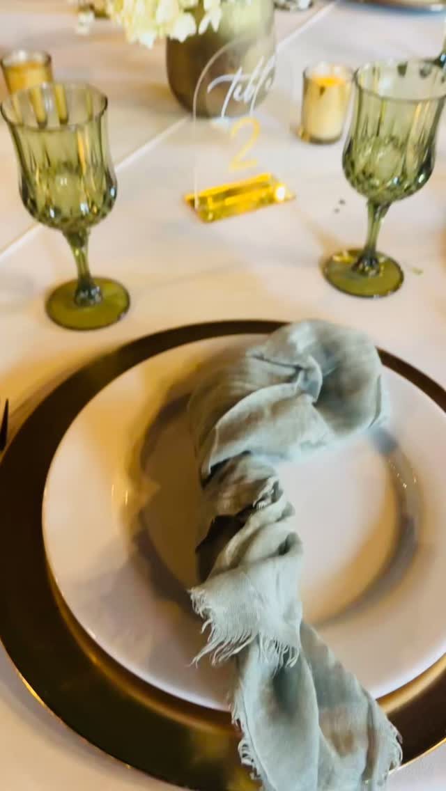
Olive green glassware grounds a dusty blue table setting so the color stays anchored instead of drifting into something too airy for fall.
I would keep the blue muted, almost greyed, and let the green vary: sage in the linens, olive in the glassware, a deeper teal if you add flowers.
The bridesmaid dresses can run cornflower without looking summery if the fabric has weight, velvet or a heavy crepe rather than chiffon.
This palette asks more of your florist than the warm options do; blue flowers in October are either dyed, dried, or expensive imports. Budget for that, or use blue in fabric and let the florals stay green and white.
3. Mustard, Burnt Orange, and Cream

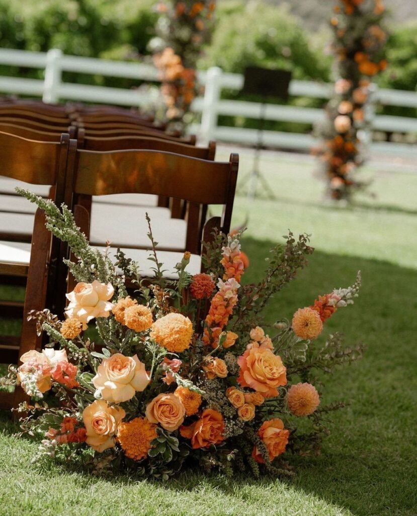
Mustard, burnt orange, and cream live or die by texture. Marigolds and burnt orange roses against wooden chairs and grass read as a real outdoor wedding, not a styled shoot.
Layered rugs underfoot, macramé behind the ceremony, pampas grass catching the light: these turn color into atmosphere.
The cream is not a background here. It is the balance that keeps mustard from looking like a caution sign and burnt orange from reading as pure Halloween.
I would use cream in the larger surfaces, tablecloths or lounge seating, and let the stronger colors come through in smaller, denser doses: a centerpiece, a bridesmaid dress, a single wall of macramé.
Outdoor settings with real autumn light help enormously; in a windowless ballroom, these colors flatten and turn muddy. This is for couples who want their wedding to feel like a good sweater, warm and slightly worn in.
4. Meadow Green, Champagne, and Cream

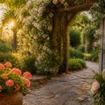
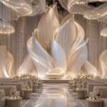
Meadow green, champagne, and cream offer an October wedding without the usual October heaviness. Light pink tulle on an arbor turns champagne in late afternoon sun, and the surrounding green foliage keeps the whole scene firmly in autumn.
Airy dresses with beadwork in champagne tones catch the same quality, catching light rather than absorbing it.
Cream taper candles are essential here, not white. White would snap the softness; cream lets the palette breathe across different materials.
I would add no more than one accent color, and only if the venue demands it: a blush in garden roses if the lawn is very green, a pale silver in flatware if the tables need definition.
The risk is washout, everything pale against pale. Champagne beadwork solves that on the dress; on tables, use texture, linen with a visible weave rather than a tight polish.
This suits couples who want fall without the folklore, the season’s air rather than its symbols.
5. Red, Orange, and Yellow
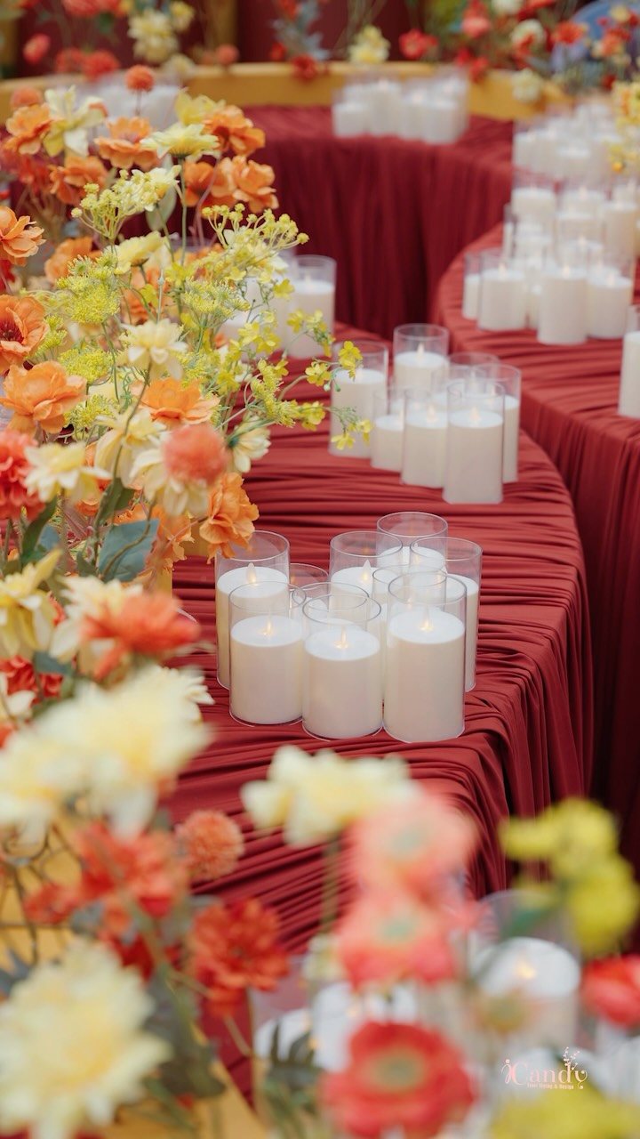
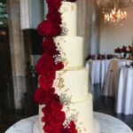
Red, orange, and yellow do not apologize. Gathered red fabric across tables carries weight no neutral could manage, while pillar candles in glass cylinders keep the arrangement from flattening into banquet hall territory.
This is the palette for couples who looked at fall foliage and decided to match it directly.
The execution matters more than the colors themselves. Crimson dahlias, orange lilies, yellow sunflowers in galvanized tin: each of those choices is specific, and swapping in generic versions of the same colors loses the point.
I would keep the containers rustic, metal or weathered wood, and let the flowers be slightly unruly. A full red tablecloth is a gamble, that much surface in one saturated color.
It works because the candles are white and plentiful; without that break, the room closes in. This palette demands space, high ceilings or outdoor air, and a couple who does not mind being noticed.
6. Pumpkin, Burgundy, and Champagne

Pumpkin, burgundy, and champagne sounds like a recipe, and that is part of its appeal. A couple holding pumpkins in front of their faces is your sign this palette has room for humor.
Burgundy in the groom’s suit keeps it from being costume; champagne in the flutes and votives keeps it from being rustic by default.
The pumpkins are real objects here, not orange approximations in other materials. I would use them as they are, scattered on steps, piled near the entrance, maybe carved as votive holders if the wedding runs into evening.
Burgundy runners on wood tables bridge the gap between the pumpkins’ informality and the champagne’s slight shimmer. Vintage flutes help; modern ones look like you are trying to class up something that does not want classing up.
This is for couples who want October to be October, leaves on the cake and all, and who trust their guests to enjoy the season rather than judge it.
Choosing a Cohesive Palette
Warm and cool tones need each other in an October palette.
Too much amber, rust, or gold in one room and the eye has nowhere to rest; a single cool note, sage or dusty blue, lets the warmth read as intentional rather than automatic.
I would repeat each color at least three times across the space, in details small enough to miss on first glance: the ink on a menu, a ribbon on a favor, a slice of fruit in a signature drink.
Seasonal blooms do the same work. Dahlias, mums, and ranunculus carry October in their petals; mixed with greenery that has turned slightly bronze, they tie the table to the month outside.
Incorporating Textures
Texture turns color into something you want to touch. A matte burgundy runner against glossy mahogany chairs, or hammered copper flatware against a gold charger, creates tension that keeps the eye moving.
I would mix velvet and satin in the bridal party rather than choosing one, and let the fabrics catch light differently as people move.
Metallic finishes need the same thought: antique gold warms a cool palette, copper does the same for blue or green. Variation works when it has a reason; randomness just looks busy.
Every finish should belong to a color already in the scheme.
Considering Venue and Time of Day
Light changes color more than most couples account for. A venue at 4 p.m., when guests arrive, wears one face; at 7 p.m., under candles or amber bulbs, it wears another.
I would visit the space at the exact hour of the ceremony and again at the reception’s start, holding fabric swatches or a single bloom against the walls and the window light.
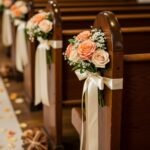
Pale peach and sage green hold up in afternoon sun; deep red and plum need evening to look lush rather than flat. The palette should already exist in the venue, not fight it.
A barn’s wood and a vineyard’s stone each suggest their own colors; ignoring that costs more in flowers and fabric than working with it.
Using Seasonal Inspiration
October color is already composed, if you know where to look. The chestnut and olive of late foliage, the plum of shadowed hillsides, the burnt orange of a particular hour before sunset: these are palettes proven by time.
I would walk the grounds where the wedding will happen, or a nearby farmer’s market, with a phone full of reference photos rather than Pinterest boards.
The traditional triad of red, burnt orange, and yellow works because it copies what the eye sees in hardwood canopy; softened with peach or blush, it gains a layer the pure version lacks. The season is the designer.
Your job is noticing.
Frequently Asked Questions
What colors should you avoid in fall?
Bright pastels clash with autumn foliage and read as out of season.
Fall weddings do better with colors that have been knocked back a step: dusty rose instead of bubblegum pink, mustard instead of lemon yellow, anything that looks like it spent a season outside already.
If a color would look normal in a spring garden, it probably fights October’s natural backdrop.
Which color is best for a daytime wedding?
Soft champagne and meadow green work best when the sun is doing the heavy lifting. Light catches champagne beadwork and cream linens differently at 2 p.m. than under string lights, and the green keeps the scene from floating away.
I would avoid the deep red-orange-yellow palette for daytime; those colors need dimming to look their best and can read flat in full sun.
What’s a good color for October?
October itself gives the palette. The reds that climb through oak trees, the browns the leaves turn once they drop, the last warmth in afternoon light before the sun falls early: those are the colors to pull inside.
Burgundy, burnt orange, hunter green, and champagne all appear in the palettes here because they echo what is already happening outside. Navy also works, though it reads more as evening sky than autumn leaf.
What are some romantic color combinations for a wedding?
Dusty rose and burgundy pair the soft with the deep, which is what romance in color usually means. For a cooler version, dusty blue against green avoids the expected warmth while still feeling intentional.
Both combinations need texture to complete the mood: lace or velvet for the warm pair, heavy linen and olive glassware for the cool one.