
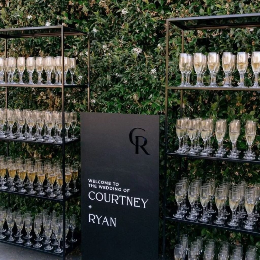
The ideas below run from a ribbon you tie yourself to a full tent ceiling that costs more than some modest weddings.
What decides which is yours is whether you need the decor to read as designed restraint or as one striking moment guests photograph.
Blacksugar paste with hand-painted silver veins on a tiered cake, white roses softening the edges; that is the kind of specific detail the list delivers.
1. Black, White
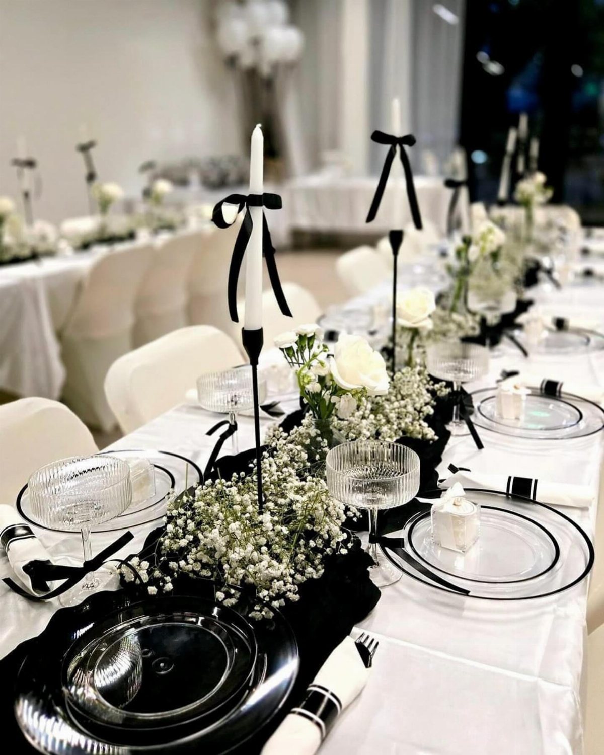
A black runner over white cloth is the simplest way to build the palette at table level. Black candleholders with white tapers add height without color; metallic ones read as neutral too.
I would check the venue’s candle policy before buying anything, since open flame rules vary and battery tapers look different in photos than they do in person.
This setup works best when the room itself has some warmth, otherwise the contrast can feel severe.
2. Minimal Signage in Black and White
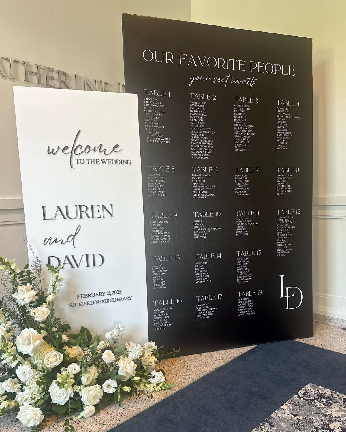
Clean signage carries the theme from the first touchpoint to the last. A welcome board at the entrance, a seating chart near the bar, and menus at each place keep the eye moving through the same visual language.
Restraint reads expensive: one typeface, generous blank space, and no competing graphics. I would ask the stationer about a black wax seal on the invitation; it costs extra but sets the tone early.
This approach suits couples who want the decor to feel designed rather than decorated, and it falls apart if every sign tries to be clever.
3. Warm Lighting
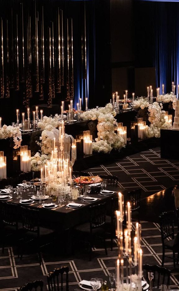
Warm bulbs keep a black and white room from feeling like a gallery after hours. Amber light softens the edges of white flowers and keeps black tablecloths from reading as voids.
I would layer the light rather than relying on one source: candelabras at table height, something overhead, and dimmers everywhere.
Warm light changes how skin tones photograph, so a photographer who knows how to balance it matters more here than in a naturally lit space.
4. Monochrome Statement Backdrop
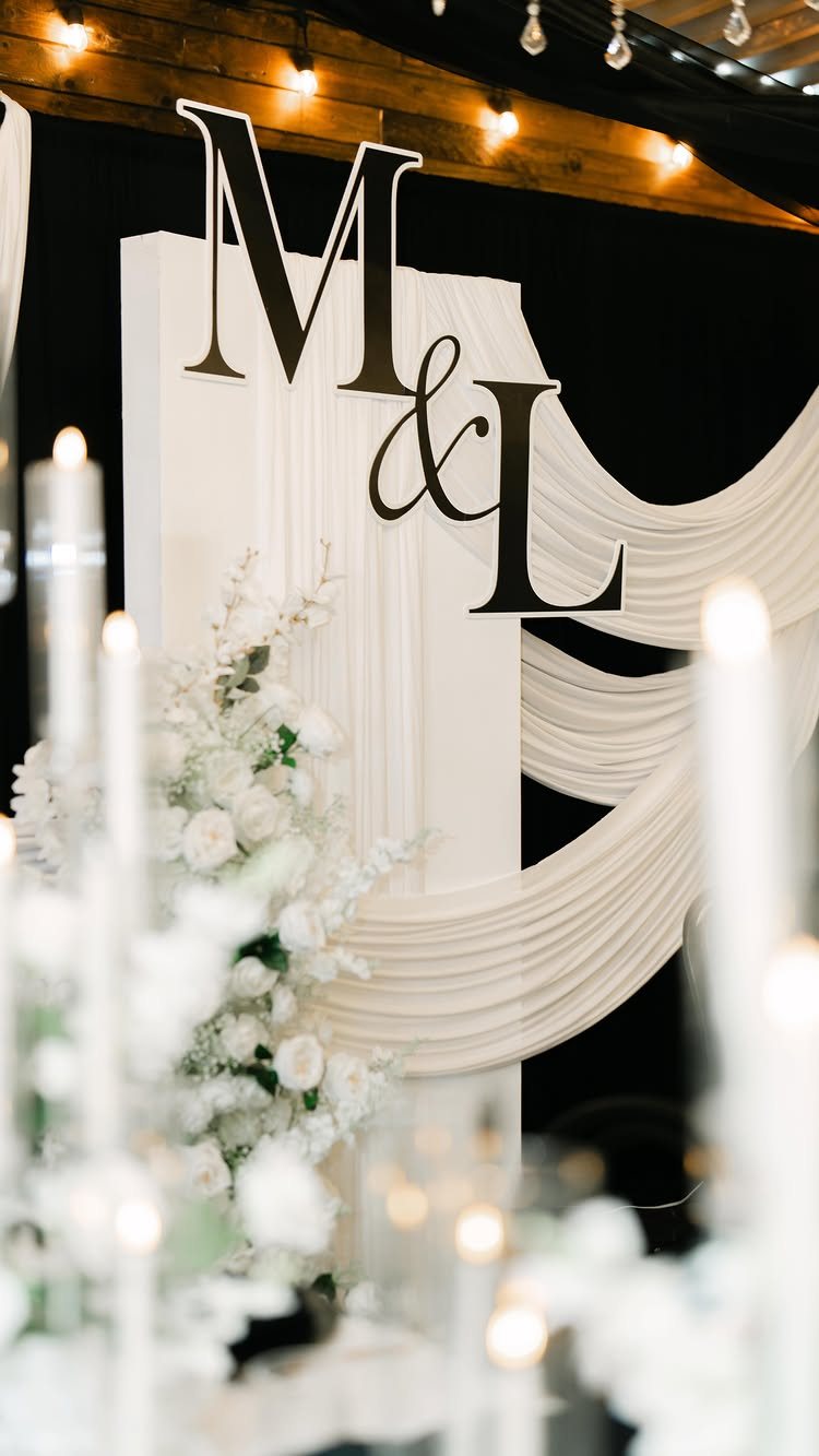
A backdrop frames the moments guests will photograph most: the ceremony, the cake cutting, the first dance. Draped white fabric against black curtains builds depth without pattern, and the couple’s initials keep it personal without clutter.
I would make white the dominant tone and use black as the frame, not the field; a mostly black backdrop swallows the couple in photos. Balloon installations or statement walls work too, though they read more celebratory than formal.
A full-room backdrop demands the most budget and labor of any decor choice here, so it suits a venue where it becomes the architecture itself.
5. Black and White Chair Decoration

Chair treatments turn rental furniture into part of the design rather than something to tolerate. White fabric with black ribbon on black chairs, or the reverse, ties the aisle to the tablescape without repeating the exact same look.
I would keep the fabric light and the knot simple; heavy drapes on every chair slow the caterer’s breakdown and add labor cost.
Small floral accents or a name tag at the seat back are optional, though I would choose one or neither. This detail pays off most in ceremony photos where the chairs fill the frame.
6. White Flowers
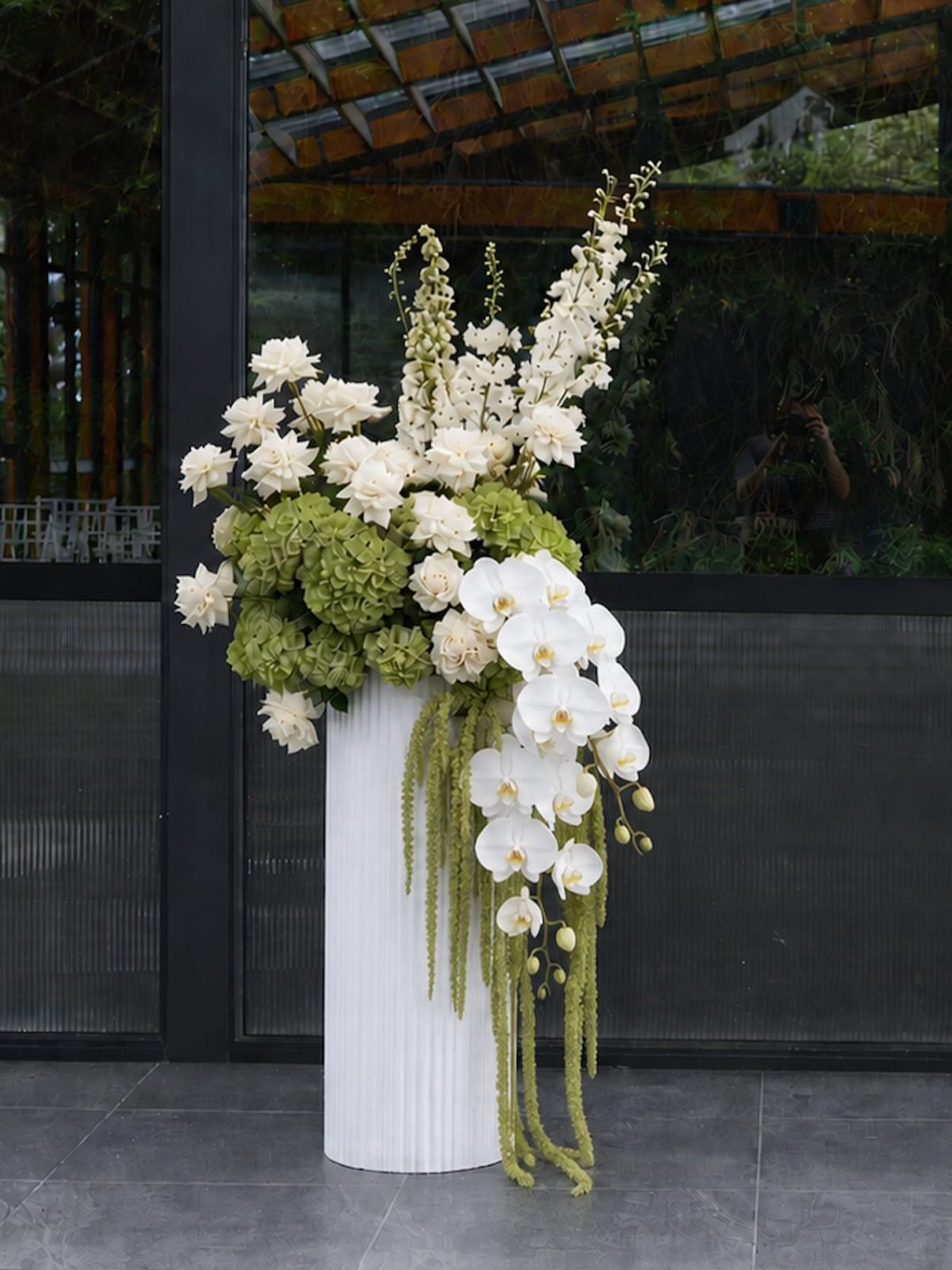
White flowers keep the palette clean without feeling cold, and certain varieties hold their shape better than others through a long day.
Orchids and roses stay crisp; hydrangeas need constant water and wilt fast in heat, so I would avoid them for outdoor summer ceremonies.
The green accents in the arrangement add necessary life; without them, white on white reads as flat in person though striking in photos.
This is the safest floral choice for a black and white wedding, which also means it is the most common.
Couples who want something less expected might add a single dark bloom or berry spray, though that edges toward a different look entirely.
7. Black and White Wedding Cake
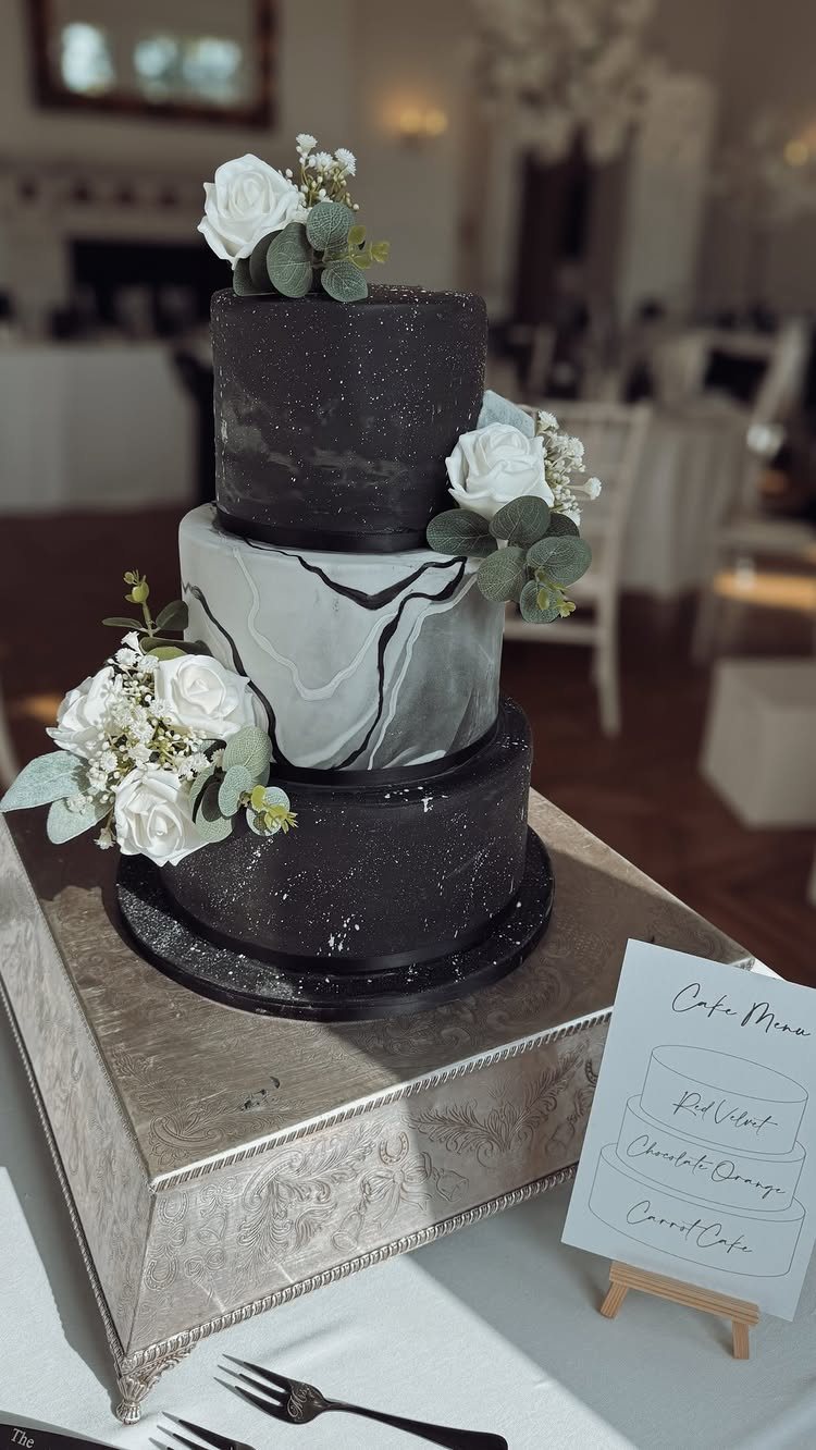
A black and white cake reads formal without trying too hard.
The tiers above run black sugarpaste with handpainted silver veins on the middle, white roses softening the edges; the maker set the bottom and top in solid black with silver splashes.
I would go two-toned only if the rest of the room is already busy. A single pale tier against dark ones, or a marble block in the center, gives the eye somewhere to rest.
For the table, a silver stand does half the work. A hoop painted black with greenery behind it, or a cluster of black candlesticks at the base, frames the cut without extra flowers you did not budget for.
Ask your baker about props before you buy any.
This suits couples who want one strong photo moment without a dessert table or late-night snack station. It trades away variety for impact; guests who remember the cake more than the meal are the ones you are feeding.
8. Black Tablecloth Reception Tables
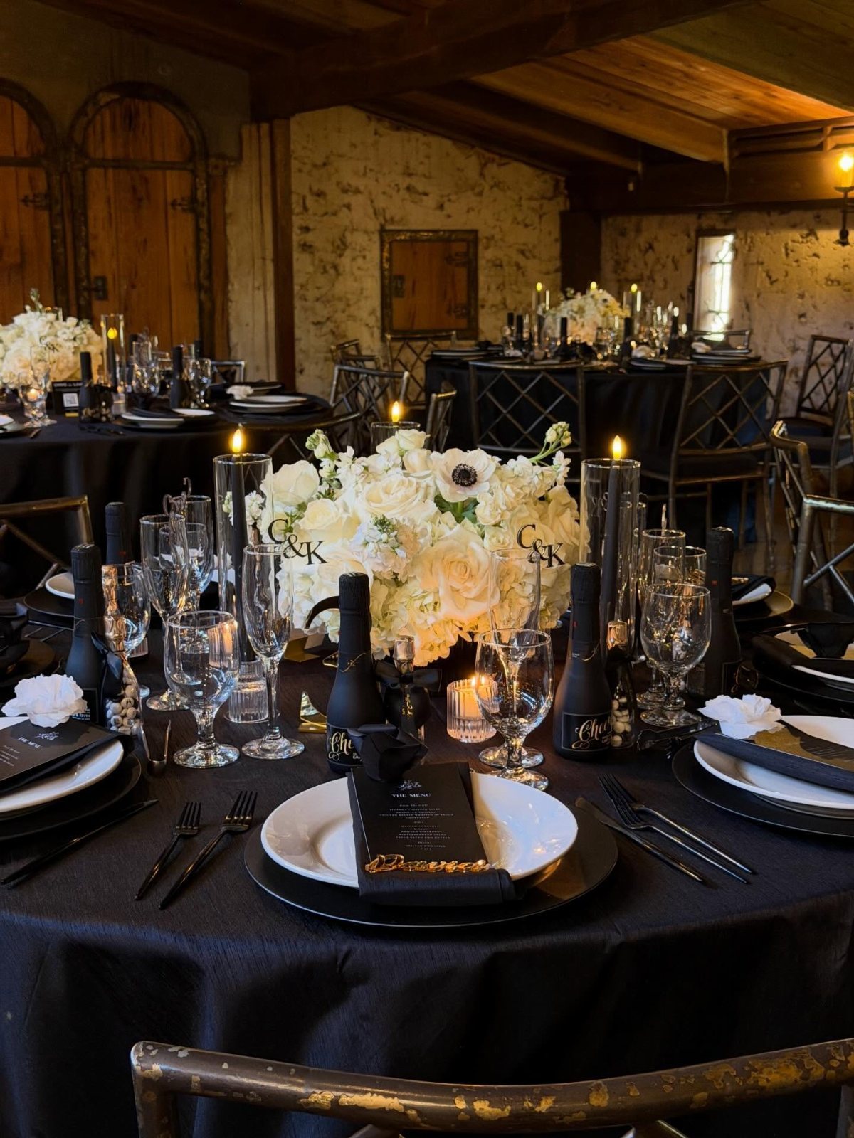
A black tablecloth does the heavy lifting so the rest of the setting can stay quiet. White plates, clear glassware, and a single white centerpiece read as intentional rather than sparse against that depth.
The fabric matters more than couples expect. Polyester blends drape smoothly and resist spills through a long reception, but linen matte absorbs light differently and photographs softer.
Renting runs less than buying for a single wedding; buying only pays off if you are hosting multiple events.
What I have seen fail is texture without contrast. A black-on-black runner or charger disappears against the cloth and flattens the whole table.
The pairing that works is one strong shape in white or cream against the dark ground, then nothing else competing for attention. This suits couples who want formality without stiffness, and it asks only that your florist stay restrained.
9. Place Settings with Black Ribbons
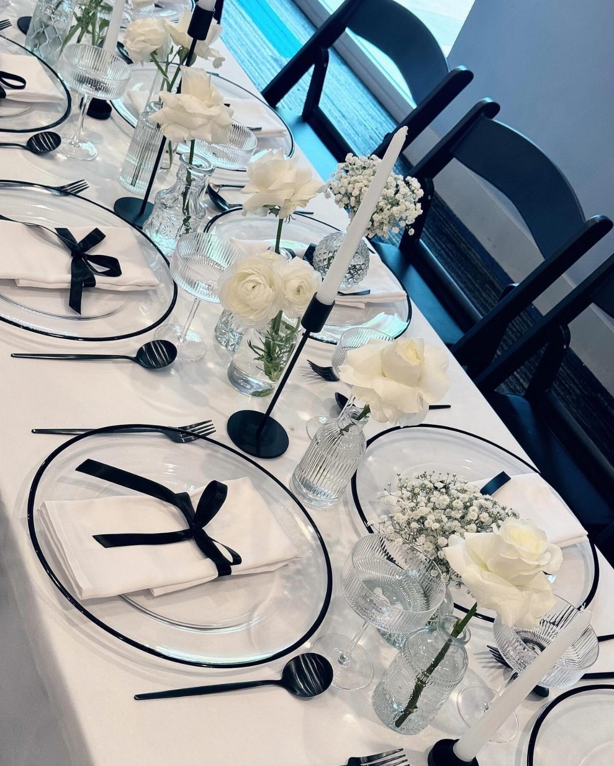
A black ribbon tied around a folded white napkin does more than mark a seat; it turns a stack of rental linens into something intentional.
Satin ribbon tied in a simple knot sits flat enough for a plate to rest above it. I would skip wired ribbon, which holds a bow too stiffly and fights the napkin’s fold.
This detail costs little because the ribbon travels with you, not through the rental company. Cut lengths the night before and assign one person to tie during setup.
It suits hosts who want the table to read as designed without renting specialty linens or charger plates.
The same ribbon, tied longer, works on paper lanterns hung above the dance floor. That is a separate project; do it only if your venue allows open flame or battery candles inside.
10. Black Taper Candle Centerpieces

Tall black tapers in clear glass cylinders give height without bulk, and they do it for far less than a floral centerpiece of similar scale.
The glass matters; bare tapers drip, tilt in a draft, and leave wax on your linens.
The pairing I keep returning to is white roses with baby’s breath, the softness against the black stems. Black glassware extends the scheme without adding another material, though it is harder to source in rental quantities than clear.
What changes the calculation is your venue’s existing light. In a bright tent or ballroom, these candles read as punctuation marks.
In a dim hall, they become the light source, and you need more of them, closer together, to keep guests from squinting at their plates.
I would not try this as the sole centerpiece at a long rectangular table; the gaps between clusters go dark and spotty. Round tables carry it better than long rectangles.
11. Black and White Menu Settings
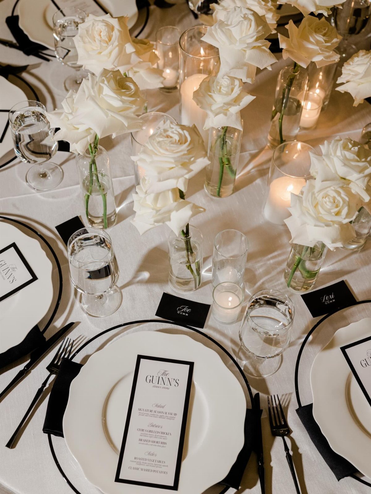
Black napkins folded flat against white linen look severe; knotted, they gain texture and shadow that breaks the monochrome just enough.
The same move works for black menus set on white plates, though I would keep the type simple and large, since candlelight does not forgive fussy scripts.
The visible setup uses black flatware, which rents at a premium and scratches more visibly than silver.
If your budget is tight, silver reads fine against this palette and leaves money for the napkin fold or a heavier paper stock on the menu.
What I would skip is a black-rimmed plate. A clean white plate lets the menu card be the design element; any rim on the plate competes for attention.
This setting suits couples who want the formality of a full tablescape without the color decisions a palette demands.
12. Black and White Tented Reception
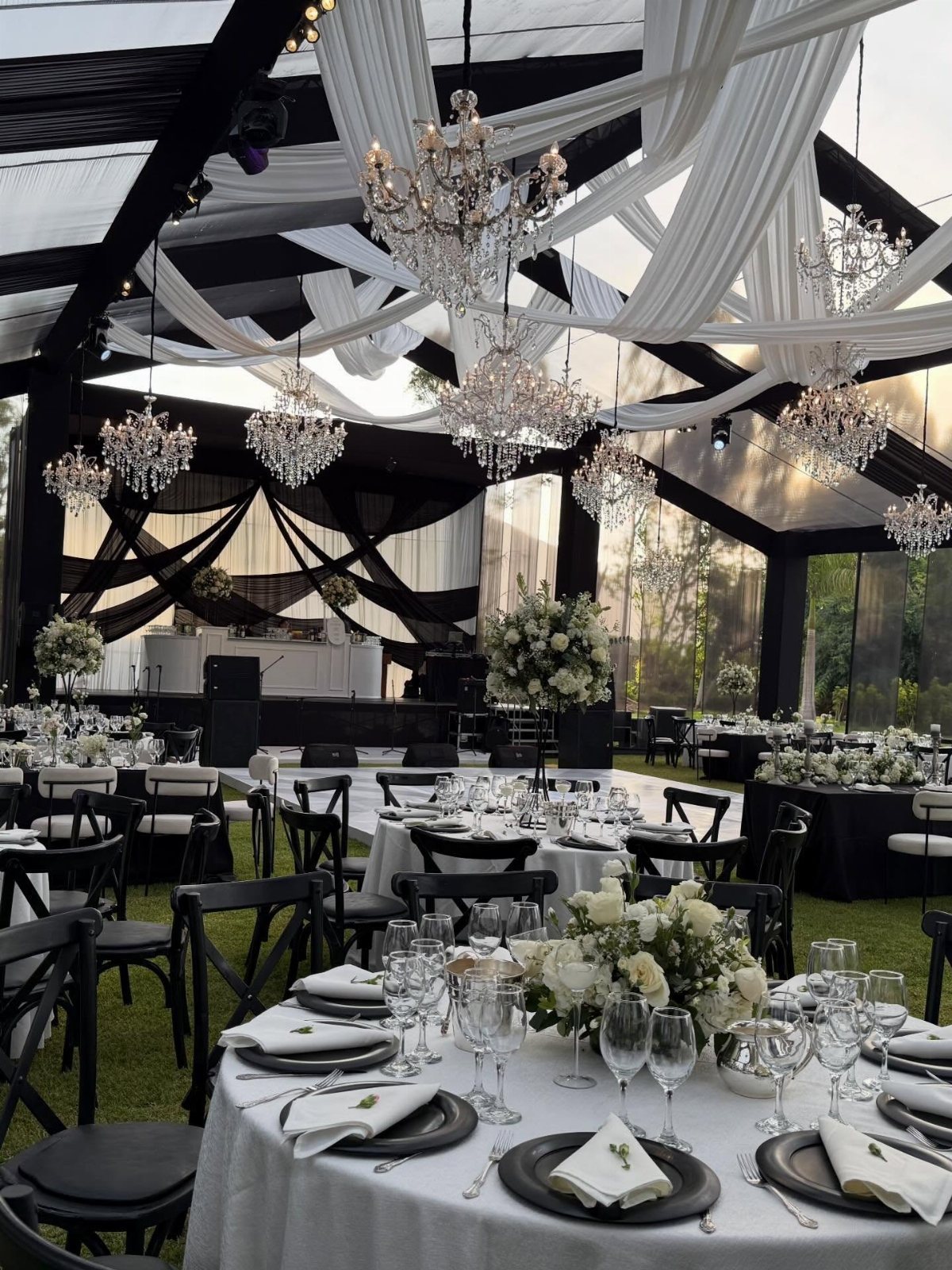
A tent with black and white draping makes the ceiling the feature, which is where guests look when they are seated and the dancing has not started yet.
Crystal chandeliers hung through that fabric give points of warmth that keep the scheme from reading as graphic or cold.
The drape pattern runs either in broad stripes or in gathered panels alternating the two colors; stripes feel more modern, panels softer and more traditional.
Installation runs higher than solid white or ivory tenting because the labor of aligning the two fabrics is precise.
What I would check before committing is your floor surface. A black-and-white ceiling over grass or gravel keeps the eye up; over a polished dance floor or pool cover, the reflection doubles the pattern and can turn busy.
This suits couples whose guest count justifies the structure cost and who want the reception to feel like an enclosed room rather than a covered patio.
13. Black and White Wedding Stationery
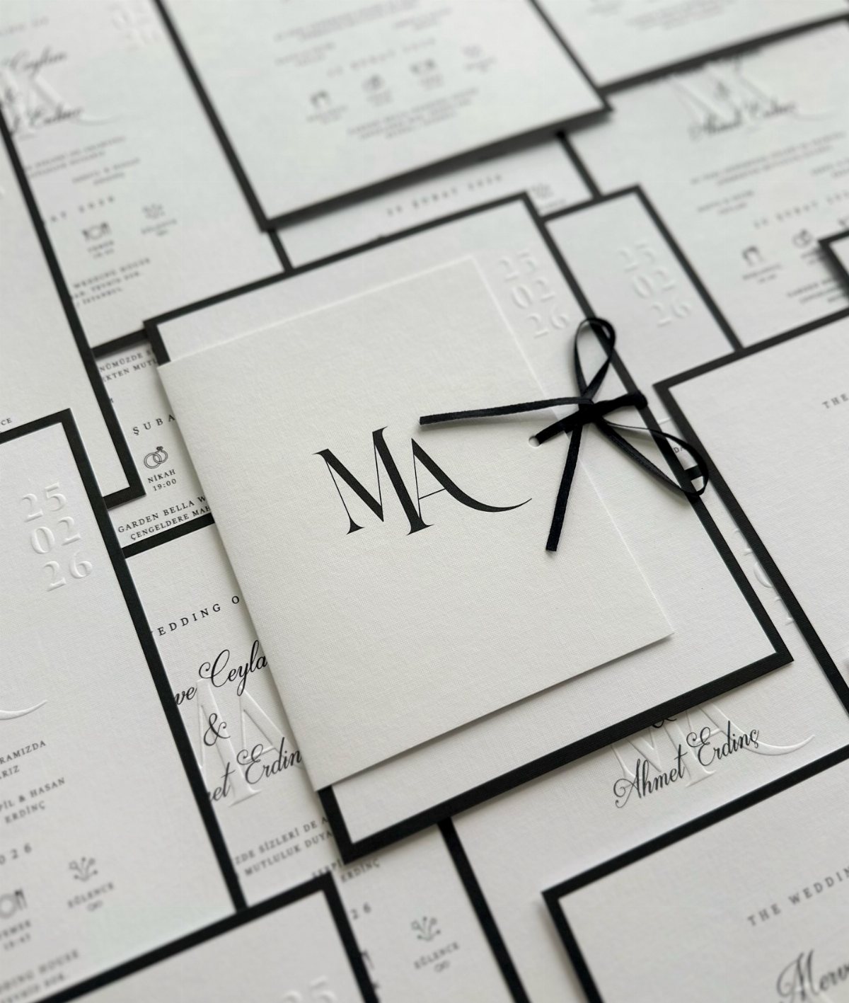
A black border on white stock reads formal without trying hard. A thin ribbon, one monogram, no second color fighting for attention: that restraint is what lets black and white stationery read as intentional rather than default.
Carry that restraint through every guest touchpoint, from save-the-date to place card. Ask your stationer for a modern typeface with generous blank space; the eye needs somewhere to rest.
This suits couples who want elegance without ornament. If your venue is already busy with molding or garden views, plain stationery steadies the room rather than adding noise.
Skip the seal for a tight guest count; the per-piece price stings when multiplied by 200.
Timelessness of Black and White
The black and white palette outlasts trend cycles because it relies on contrast rather than color theory.
That contrast works in any era because human eyes read it the same way: white advances, black recedes, and the tension between them creates structure without a hue to argue over.
What keeps it from reading as stark is balance, not addition.
Warmth from bulbs, fabric texture, and the occasional green stem do the work of a third color without breaking the two-tone rule, and that restraint is what makes the result feel considered rather than dated.
A palette this old risks looking borrowed from another decade if every element competes; the couples who pull it off let one thing carry the frame and leave the rest quiet.
I would treat black and white as a decision about proportion first and palette second. The ratio matters more than the pairing itself, and getting it wrong reads as theme rather than tone.
Color Combinations
Black and white tolerates a third color better than most palettes because it has no hue of its own to clash.
Gold adds warmth without softness; it reads as metal, not tint, and catches candlelight in a way black alone cannot. Blush does the opposite, softening the edge between the two tones until the room feels inhabited rather than staged.
Greenery operates as a neutral with texture; the green in stems and leaves is dark enough to sit near black and varied enough to keep white flowers from looking manufactured.
I would add only one of the three, and sparingly. Two accents split the monochrome into something busier than most black and white couples intend, and all three turns the palette into a different wedding entirely.
The restraint that makes the base work applies to the accent too. A gold candle rim, blush napkins at the head table, or greenery only in the bouquet: one gesture, repeated, reads as intention.
Scatter all three and the eye loses the thread.
Seasonal Adaptability
The same black and white setup reads differently in July than in January because material carries temperature.
Summer calls for lighter fabric, more bare surface, and glass over metal; the same tenting in broad stripe feels heavier when the air is already thick.
Winter gains from velvet, wax, and weight: black tablecloths in a denser weave, tapers that burn longer than the evening, and less empty space between objects.
I would not swap the palette itself by season. Black and white in summer with linen and orchids is still the same decision as black and white in winter with velvet and anemones; the adaptability is in texture, not tone.
What changes is how much contrast the room can hold before it feels clinical. Bright summer light needs more black to anchor it; short winter days need more white to keep the space from closing in.
The adjustment is a matter of proportion, not a different scheme.